In an extensive article by Akinori machino, published in Medium.comis unravel the secrets of the new typography developed by those of Cupertino: the San Francisco.
The new typeface is being used to unify the appearance of all platformsAfter abandoning Helvetica, a font used by Apple for many years, the intention is to aesthetically stand out and improve readability on all device screens, since Helvetica is not suitable for small screens.
The San Francisco is not a single source
On the other hand, it has been discovered that the San Francisco is not a single source, but several:
San Francisco has a ton of features designed to make it highly readable. In fact the versions for the Apple Watch and iOS / Mac they are not even the same. Version SF used on iOS / Mac and SF-Compact on on the Apple Watch. The difference is seen in round letters such as o or the e (…) Besides this, the family is divided into two sub-sources called text y Display in which "optical size" is taken into account; one is used for small guys, the other for big guys.

The San Francisco family is divided, in turn, into two types of subtypes that are more specifically suited to different types of screens. The "iDevices" use the standard San Francisco, while the Apple Watch, the smallest device that the brand has launched, uses the compact SF, a typeface readable on tiny screens.
A dynamic typeface
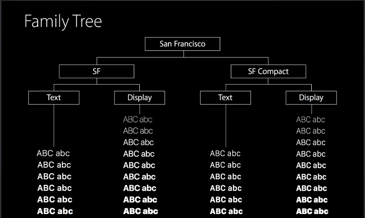
As we can see in the table above, each one of the fonts is subdivided into two different formats, called "Text" and "Display". These two formats are used intelligently, making use of one of the characteristics of this new typeface, dynamism. What this dynamic effect does is that when the font is larger than 20 points it automatically switches to Text, while in font sizes smaller than 20 points it switches to Display. Thus, engineers and designers don't have to worry about which font to use at any given time, the clock will adapt the format to each screen size automatically.
In summary, Helvetica, which was created in 1957, may have been out of date as far as the digital world is concerned, so the dynamic typeface is what is demanded in a digital ecosystem in which the same letter has to be seen and read on a multitude of screens of different sizes, from the big 5K screen of a next-generation iMac to the tiny screen of an Apple Watch. And all this, with the same typography.