Although at first glance it seems a minor inclusion within the multiple novelties that OS X Yosemite boasts, the so-called «Dark Mode» o dark mode may be a joy to many users who prefer a higher black and white contrast to better focus their attention on the various menus and the dock.
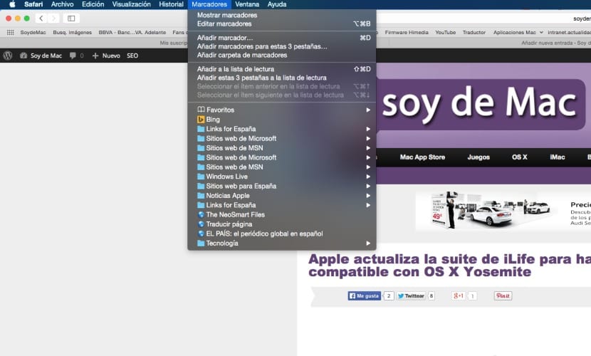
This option basically what it does (as we already discussed in another post a few months ago), is to perform a swapping between menu bar colors and fonts, that is, order the colors in reverse as shown in the image that accompanies the header of the article. It does not really change the color as such to black as has been said many times, but simply orders the color differently to give a darker look to the overall system.

The function is very simple to activate and deactivate by going to the General option in System Preferences, we will see a new option entitled "Use dark menu bar and Dock" which appears just below the drop-down menu «Appearance». Clicking on this option automatically activates the dark mode which, as I have commented, will exchange the hue of the color between the source and the bar itself, this is also of course transferred to the menus, the icons of the programs in background…
Unlike the beta versions of Yosemite, the system fonts are not changed to "bold" so no thickness is added to them. On the other hand, it is logical to think that for some this dark mode makes reading the menus and viewing the icons more off and difficult in general, for this there is also the option "Use LCD font smoothing when available" when final within the same panel of the General menu in system preferences that will help to "slim down" the letter.
Personally, it seems to me too dull aesthetics and it is not attractive to the eye, so my preference is for the normal standard display already predefined with the system, but as the saying goes ... for tastes «the colors».
I also prefer the classic mode, but I said. To taste the colors. For me that I come from Linux, the Mac OS seems not very configurable, that has the advantage that you have something that always follows the same constant and is therefore uniform, on the other hand it leads you in part to that of "all the same" which for me does not match much with 'Think different'. Anyway I love Mac and its OS and wish I had made the leap sooner. Since I prefer the uniformity and the UX that Mac gives us to everything else I have tried.
Great Post, very helpful! A question that I have if you could solve it for me, how do I add icons such as volume or bluetooth or clock in the top menu bar of the Mac?
Thank you very much. A greeting!
I found your Post that talks about it but I can't find the CoreServices or Manu Extras folder in the library. Could it be that for IOS Yosemite they have changed it? thank you very much
https://www.soydemac.com/2013/10/22/elimina-restaura-y-cambia-los-iconos-del-menu-bar/