The logo of the largest technology company in the world is a reflection of its name. When you listen "Manzana", you see a bitten apple, and when you see a bitten apple, you think of Apple Lossless Audio CODEC (ALAC),. In this way, and for more than three decades, the Cupertino firm has managed to establish itself in the popular imagination of millions and millions of people throughout the entire planet. But the apple logoAlthough similar in concept and form, it has not always been exactly the same. Today we look back and walk through thethe history of the Apple logo.
Walking between logos
The very origin of apple logo remains a mystery seasoned by various legends. To this day it is still not entirely clear what inspired it, although various legends try to explain it.
The first logo, 1976
It is the most different of all, the one that breaks the rule and the one that could explain why Apple is called Apple and why the Apple logo ended up being an apple. This first apple logo It reflects the moment in which Isaac Newton, sitting under an apple tree, falls an apple, a fact that helped him to develop the laws of universal gravitation. However, this image was only used during that year.
First Apple logo 1976
The Multicolored Apple, 1977-1998
It has been the apple logo longest lasting over time (21 years) and, without a doubt, the one that has contributed the most to the image of the brand. Created by Rob Janoff, art director in Silicon Valley, commissioned by Steve Jobs himself, it consists of the already typical bitten apple divided into horizontal stripes and uniform colors that, from top to bottom are: green, yellow, orange, red, purple and blue.
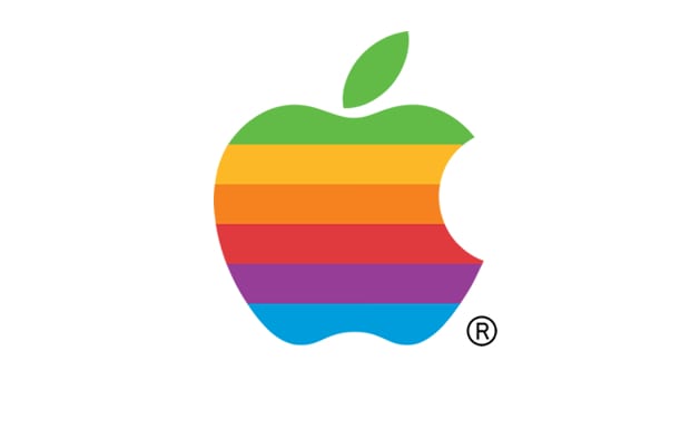
Apple logo, 1977-1998
The translucent apple, 1998
Coinciding with the launch of the new iMac computers, whose main attraction was the transparent casing of different colors (blue, green, pink, purple and orange) that protected the machines, Apple transformed the apple of its logo to a translucent blue color.
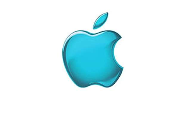
Apple logo in 1998
The Monochromatic Apple, 1998-2000
In 1998 Apple was on the verge of complete bankruptcy. The return of Steve Jobs after being thrown out through the "back door" of the company that he himself had founded together with Steve Wozniak constitutes a key and historical moment for the company only comparable to the moment of his birth. Changes were necessary, from the largest transformations to the seemingly most insignificant modifications. Jobs decided that apple logo It should be more visible so he gave it this look, increased it in size and placed it in the places where we all see it now. It was the beginning of the rebirth of Apple.
Apple logo between 1998 and 2000
Aqua, 2001-2007
It is a version of the previous one used mainly in software
Apple logo between 2001 and 2007
Chrome version since 2008
From 2008 until now, Apple has adopted this «Chrome version» for its logo consisting of a combination of whites with an aluminum texture and that we can find in the entire range of products from Apple.
Apple logo since 2008
What will be the next step in the evolution of apple logo?

It seems that there has been a step backwards, until iOS 6 when you turned on the device the chrome apple appeared, but now with iOS 7/8 the one used between 1998 and 2000 appears, in white or black depending on the color of the iPhone, iPad or iPod.