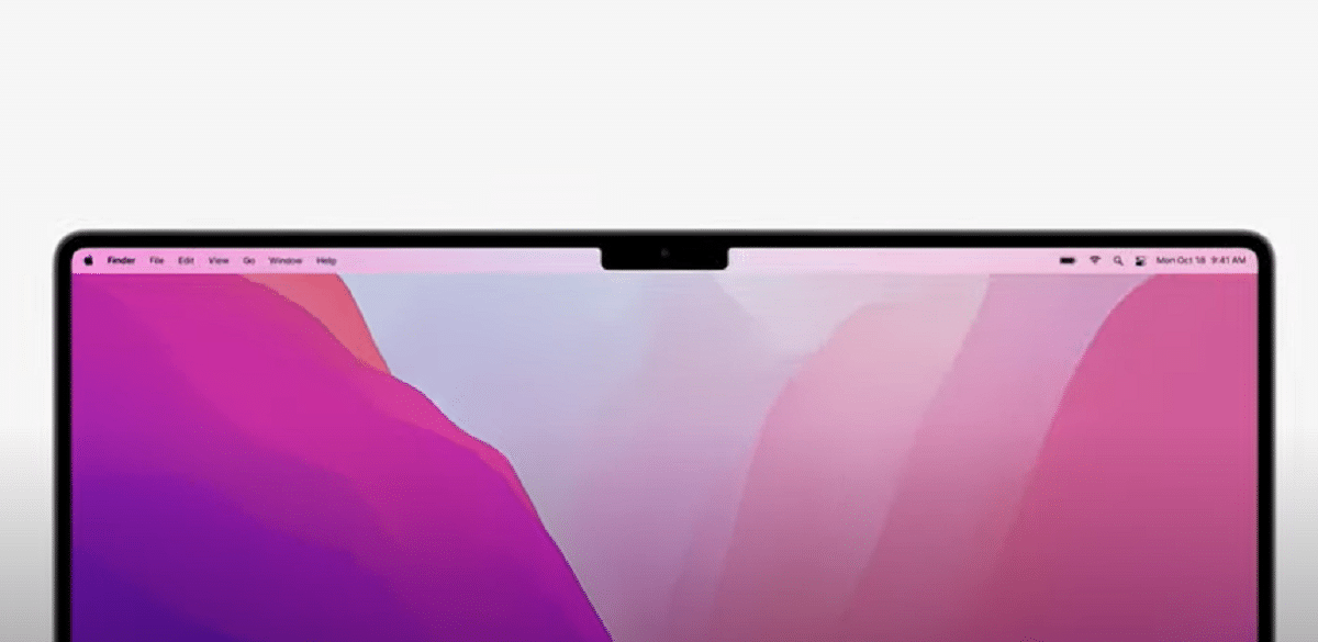
When the new MacBook Pros were introduced, one of the most striking features was that a large iPhone-style Notch was visible on the screen. Many users shouted to the sky, but it has been proven that it is not so bad. As we get used to the iPhone, we have gotten used to this gap in the MacBook Pro. However, it is true that not everything has been good. But now with macOS Monterey and its updates we are seeing how the problems that have arisen are being corrected.
The Notch has always been and will always be highly controversial. A kind of rectangular black hole that swallows everything that passes through it. There was a solution so that the applications were not interfered with by this space. The applications could be scaled and thus the Notch did not hide important parts. But of course, that could not always be the case. With the new updates, it seems that the thing has been solved. Of course, I notice that the space is still there, it has not been eliminated, which would also have been a good solution.
One of the most common problems was that menu bar items are partially hidden behind the notch , as some call it, instead of avoiding the menu area. Apple has now fixed this annoyance in macOS Monterey 12.1. In this message that we leave you next, you can see very well what the problem is that I am talking about.
WTF HAHAHAHA HOW IS THIS SHIPPABLE? WHAT IS THIS ?! pic.twitter.com/epse3Cv3xF
- Quinn Nelson (@SnazzyQ) October 26, 2021
The company provides developers with a compatibility mode which turns off the active display area. This allows the system to render the application menus below the Notch, avoiding any design issues.
The system provides a compatibility mode to prevent applications from inadvertently putting content into the region that the enclosure occupies. When this mode is active, The system changes the active area of the screen to avoid the camera housing. The new active area ensures that the content of the application is always visible and not obscured by the camera housing.
Well, I have not understood what is the solution they have given ... The fact is that it is super badly planned because also the icons in the Menu area (those on the right) occupy especially more width than in the past (for example compared to my old MacBook Air 2011 ).
It is super uncomfortable not to see menus. I was one of those who reported this to Apple, for the record of the poor resolution of this. But I also don't see how they are going to fix it with something drop down when it reaches the notch limit? I don't think ... But come on, it's fatally done right now