In 10 days Apple will celebrate 31 years since its most successful team was presented to the public on January 24, 1984 and this is none other than the Macintosh 128K. During all this time, many of you will have been able to see first-hand how the design of this equipment has evolved towards a more casual style with the first iMac until it became a Mac with a more professional design and advanced in aluminum, without losing all the essence of all-in-one equipment that has always characterized it.
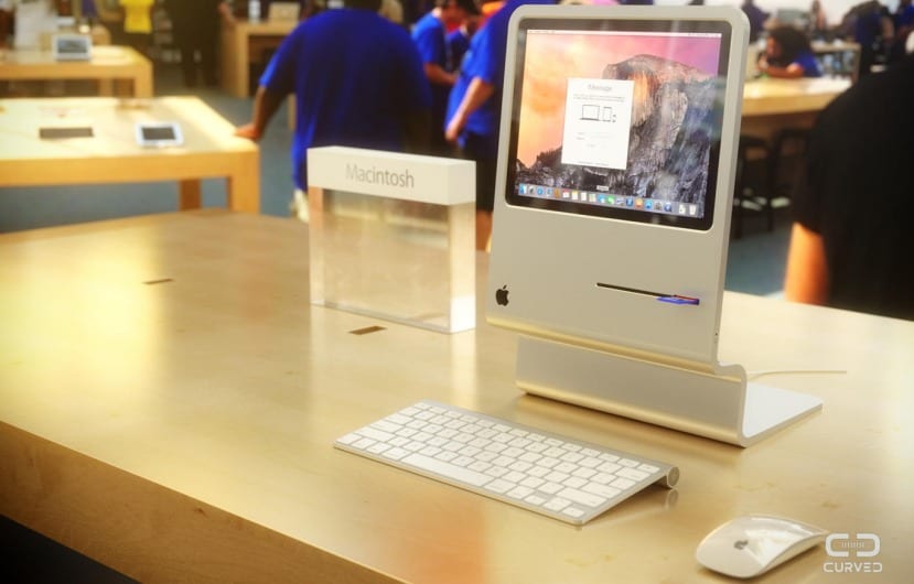
Now on the occasion of this celebration, the people of Curve have decided to create a different concept of the current iMac through various rendered images, taking advantage of the old Macintosh design but giving it a facelift to fit the image that we all have of a current team, even fictitious due to the extreme thinness of those images.
In this futuristic redesign we will not find any large screen, on the contrary, the Curved team has integrated into its design an 11,6-inch screen within an aluminum frame that imitates the shape of the original Macintosh. Instead of running a typical OS X system, the new Macintosh would integrate various controls adapted to touch screen to be able to use the screen in this way in addition to 128 GB of storage and 8 GB of RAM memory.
The back of this imaginative Macintosh would feature a USB 3.0 port in addition to another Thunderbolt port, however the latest rumors claim that Apple would be integrating a USB 3.1 type C connection (smaller) in the new MacBook Air, which would be presented this year at WWDC and it would not be bad to integrate it into this concept. Returning to the Mac, the back would have a shiny Apple logo in the style of the MacBook line, according to Curve's own website, this redesign responds to a meeting of paths between the iMac and the iPad, something like a kind of hybrid equipment.

The colors in which it would be available would be the classic ones on iOS devices, that is, in Silver, Gold and Space Gray. Personally, it seems to me a curious, imaginative but impractical and above all unreal design, although as a design effort it is not bad at all.
