Always with the intention of knowing the history of Apple through its image, today we will take a brief look at the use of typeface in the marketing of the Cupertino company. That is, we will focus on the fonts that Apple used in advertising, logos and other aspects of its external communication. Perhaps, on another occasion, we will deal with the types of the system and the keyboard.
Before continuing, it is good to know that Apple had a fundamental participation in the development of programs and technology for the creation of digital typefaces.

Well, if we go back to what we could call prehistory, we find that the first type of font used is a handmade one, as we see in the company's historic first logo, designed by himself. Ronald Wayne. It is a typeface that imitates the monumental lapidary inscriptions of ancient Rome. (I know most of you know, but the character portrayed there is Isaac Newton).

The second typeface in history is the Motter Tektura, which inaugurates the purely industrial and commercial stage of the company. The typeface was designed by the Austrian Othmar Motte in 1975. At that time, it was considered a modern and avant-garde typeface, two concepts that Apple wanted to associate with its products. It was used essentially for the Apple I and the Apple II.
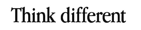
In 1984, the Cupertino corporation adopted the Garamond, a classic XNUMXth century typeface made by the French Claude garamond. Actually, a special version of the font was made, somewhat more condensed, which was called Apple Garamond. As we discussed in a previous post, the use of a classic cut typeface made a tremendous but harmonious contrast with the equipment offered.

Gradually, at the end of the 90's and the beginning of the new century, but definitely since 2002, Apple changes its font to Myriad, symbolizing a new stage, a renewal. Myriad is a contemporary typeface but with strong foundations in tradition, created by Robert slimbach. Undoubtedly, this type of letter gave new air to the communication and the entity of the company, in accordance with the design line of the products, which began to show a more sober and simple line.

Finally, with the launch of the Mac Book Air, another small change was introduced: a very fine print, consistent with the ultra-thin notebook. Some speculate that this typeface is called Kozuka Gothic Pro, but I think it's just the light version of the Myriad.
The source of the MacBook Air is the myriad Pro light